- Free Estimates
Color trends don’t exist in a vacuum. They reflect how people want their spaces to feel, especially at home. As we move into 2026, the shift is clear: homeowners are moving away from sterile neutrals and embracing warmer, bolder tones that add depth, comfort, and personality. This doesn’t mean loud or overwhelming color. It means intentional choices that feel grounded, confident, and livable.
For homeowners in Avon, CT, where traditional architecture meets modern updates, the 2026 color palette offers practical inspiration. These colors work just as well in classic Colonials as they do in updated interiors and contemporary additions.
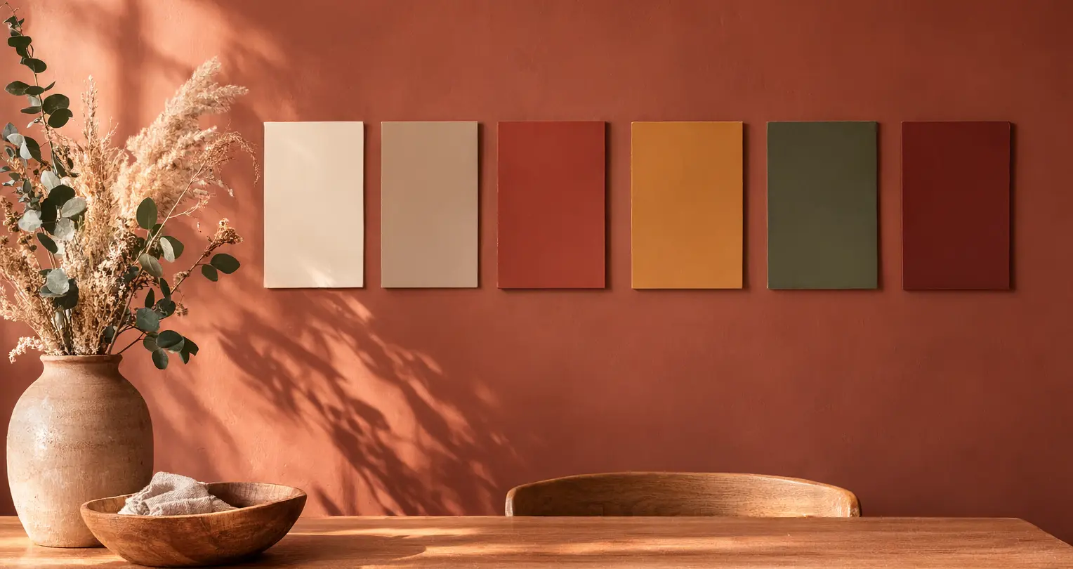
✔ Warm neutrals replace cool grays as the primary foundation. ✔ Rich browns and earthy tones add depth and character. ✔ Muted terracotta and clay shades bring warmth without overpowering. ✔ Deep greens and warm blues remain versatile favorites. ✔ Soft warm whites outperform stark white for interiors and trim. |
The past decade leaned heavily on cool grays and stark whites. While clean, those palettes often felt impersonal. The 2026 shift reflects a desire for spaces that feel welcoming and expressive without sacrificing sophistication.
Several factors are driving this change:
Warm, bold tones provide visual weight and emotional comfort while still allowing flexibility in design.
Neutrals aren’t going away—but they’re changing. In 2026, neutrals are warmer, richer, and more layered.
These colors replace cool gray walls and stark whites, especially in living rooms, hallways, and open-concept spaces.
Earth-based neutrals are ideal for homeowners who want timeless appeal with modern warmth.
Brown is no longer dated. In 2026, it’s refined, intentional, and confident.
Espresso, chocolate, and dark walnut tones bring a sense of structure and permanence. They work particularly well in Avon homes with traditional layouts, crown molding, or custom millwork.
These tones add depth without overpowering a room when applied strategically.
Terracotta has evolved. In 2026, it’s less rustic and more refined.
These shades work especially well in:
Terracotta tones add warmth without the intensity of true red, making them easier to live with long-term.
Yellow is returning in a calmer, more grounded form. Think warmth, not brightness.
Ochre and golden tones reflect light beautifully while maintaining warmth. They pair well with white trim, wood cabinetry, and brass or black hardware.
Avoid overly saturated yellows. The 2026 approach favors depth over vibrancy.
Green continues to be a favorite, but 2026 greens are deeper and warmer.
These shades are particularly effective in Avon homes due to the surrounding natural landscape.
Green bridges traditional and modern styles effortlessly.
Blue remains popular, but cooler navy and icy blues are fading. Warmer blues are taking their place.
Best applications include:
These blues feel grounded and mature, avoiding the starkness of cooler shades.
These tones are bold, but they’re meant to be used intentionally—not everywhere.
Rust and burnt orange bring energy and warmth without feeling trendy when paired with neutral surroundings. In smaller doses, these colors can completely change the personality of a space.
Pure white is being replaced by warmer alternatives that feel softer and more forgiving.
These shades are ideal for:
Warm whites pair better with 2026’s earthy palette and reduce harsh contrast.
Trends are helpful, but application matters more than popularity.
Warm, bold tones succeed when they’re tailored to the space—not applied uniformly.
Even the best colors can fail if applied incorrectly.
Professional preparation, color matching, and finish selection matter just as much as the color itself.
The most popular paint colors for 2026 include warm neutrals, rich browns, muted terracotta, olive and moss greens, warm blues, and soft golden yellows. These colors emphasize warmth, depth, and natural balance rather than cool or sterile tones.
Yes. In 2026, bold colors are being used more intentionally. Deep greens, warm blues, and rich browns work well in traditional homes when applied as accent walls, built-ins, or paired with warm neutrals and classic trim.
Warm neutrals, earthy greens, and soft warm whites are especially appealing because they feel timeless and adaptable. These colors photograph well, suit a wide range of furniture styles, and create inviting spaces for homeowners and buyers alike.
Limit bold colors to one focal wall, lower wall sections, cabinetry, or smaller rooms like powder rooms or offices. Balance them with lighter surrounding colors and warm lighting to maintain visual comfort.
In many cases, yes. Warm tones complement New England architecture, natural wood elements, and seasonal lighting changes better than cool grays or stark whites, which can feel flat or cold during darker months.
If you’re planning a painting project and want expert guidance on choosing and applying warm, bold tones that will last, working with an experienced local professional with interior & exterior services makes a difference.
Avon Professional House Painter brings the knowledge and precision needed to translate 2026 color trends into finished results that feel balanced, timeless, and tailored to your home.